
When developing websites with WordPress, managing media uploads—particularly images—is a core task. While it may seem simple, WordPress offers a robust and flexible system for handling media that ensures optimal performance and adaptability for different use cases.
In this article, we’ll explore how WordPress handles media uploads, processes image files, and resizes images, as well as some best practices and tips for web developers working with WordPress media management.
How Media Uploads Work in WordPress
Media uploads in WordPress are handled through the built-in Media Library. Here’s a breakdown of the upload process:
Upload Process
When a user uploads an image (or other media types like videos or PDFs), WordPress stores the media in the wp-content/uploads/ directory. By default, WordPress organizes uploaded media files by year and month folders. For instance, an image uploaded in October 2024 will be saved in wp-content/uploads/2024/10/.
File Types
WordPress allows various media formats, including JPEG, PNG, GIF, SVG (with additional support), PDF, and videos such as MP4. It also ensures that the uploaded file size adheres to the limits set by your hosting provider or WordPress configuration.
Database Entry
When media is uploaded, WordPress creates a record in the database in the wp_posts table with a post_type of attachment. This allows WordPress to manage the media files and associate them with posts or pages when necessary.
Image Resizing in WordPress
When an image is uploaded, WordPress automatically generates multiple resized versions of the original image, commonly referred to as image thumbnails. This feature ensures that images can be optimized for different use cases (e.g., full-screen images, gallery thumbnails) without forcing the server to resize images on the fly, which would be computationally expensive.
Default Image Sizes:
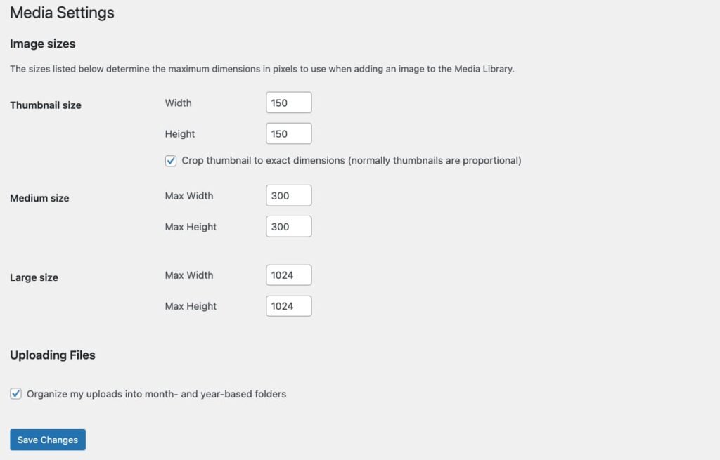
By default, WordPress generates the following image sizes:
- Thumbnail (150px by 150px)
- Medium (300px by 300px)
- Large (1024px by 1024px)
- Full Size (the original image size)
These sizes are defined in the WordPress settings and can be adjusted by going to the Settings > Media page. WordPress stores these values in the database, and when an image is uploaded, it generates these versions of the image.
Note that in the Media Library you only see one version of each file, but if you check the wp-content/uploads/ directory, you’ll see different files for different sizes of each image.
Adding a Custom Image Size
WordPress allows adding custom image sizes through the add_image_size() function. This is useful when building themes or plugins that need specific dimensions for image display.
// Add custom image sizes
add_image_size( 'custom-small', 400, 300, true );
add_image_size( 'custom-large', 1200, 800, false );
This code snippet will add two new image sizes called custom-small and custom-large. The true argument in the first size specifies that the image should be hard-cropped, meaning WordPress will crop the image to exactly fit the dimensions rather than scaling it.
Using Different Image Sizes in the Gutenberg Editor
The Gutenberg block editor makes it easy for users and developers to choose image sizes directly when adding images through the editor. Once the image is added, the Block Settings Panel on the right side of the editor allows you to choose from various predefined image sizes.

To make custom sizes available in the Gutenberg editor’s image size dropdown, you need to use the image_size_names_choose filter. This will label the custom sizes for easy selection by users:
// Make custom image sizes selectable in Gutenberg
function my_custom_image_sizes( $sizes ) {
    return array_merge( $sizes, array(
        'custom-small' => __( 'Custom Small' ),
        'custom-large' => __( 'Custom Large' ),
    ));
}
add_filter( 'image_size_names_choose', 'my_custom_image_sizes' );
After adding this code, users will be able to choose “Custom Small” and “Custom Large” from the image size options in Gutenberg.
Using Different Image Sizes in PHP
The wp_get_attachment_image() function allows you to get the image with the specified size and output it in your desired format
// Get an image by its attachment ID and output in a specific size
$image_id = get_post_thumbnail_id( $post->ID );
$image = wp_get_attachment_image( $image_id, 'large', false, array( 'class' => 'custom-class' ) );

echo $image;
This will return the image in the custom size large’ and apply any additional attributes (like a custom CSS class) that you pass in the fourth argument. The HTML output will be something similar to this:

Note that the src attribute is set to the specified size (large) but it automatically specifies other sizes in the srcset attribute.
If you need to retrieve just the image URL and size information (without rendering the <img> tag), you can use the wp_get_attachment_image_src() function. This is useful when you want to work with the image URL directly, for example, when using it as a background image or in a JavaScript context.
// Get the URL, width, and height for a specific image size
$image_src = wp_get_attachment_image_src( $image_id, 'large' );

echo '<img src="' . esc_url( $image_src[0] ) . '" width="' . esc_attr( $image_src[1] ) . '" height="' . esc_attr( $image_src[2] ) . '">';
In this example, $image_src[0] contains the URL of the image, $image_src[1] is the width, and $image_src[2] is the height. You can use these values to generate your HTML or work with the image programmatically. The HTML output will be similar to this:

Responsive Images in WordPress
As of WordPress 4.4, the platform introduced native responsive image support, automatically adding srcset and sizes attributes to images. This ensures that browsers download the most appropriate image size for the visitor’s screen resolution and viewport size. For instance, an image tag generated by WordPress might look like this:
<img src="image-300x200.jpg" srcset="image-300x200.jpg 300w, image-600x400.jpg 600w, image-1024x683.jpg 1024w" sizes="(max-width: 600px) 100vw, 600px" />The srcset attribute contains a list of image URLs with their corresponding widths, while the sizes attribute defines when each image size should be used based on the viewport width. This helps ensure that users on smaller devices download smaller images, which improves performance and reduces bandwidth usage.
Image Compression
WordPress compresses JPEG images upon upload to optimize them for web performance. By default, the compression rate is set at 82%. You can change this compression setting with a filter.
// Set JPEG compression to 90%
add_filter( 'jpeg_quality', function( $arg ) { return 90; } );
Regenerating Thumbnails
If you’ve changed the default image sizes or added custom image sizes after images have already been uploaded, you’ll need to regenerate thumbnails for previously uploaded images. There are plugins such as Regenerate Thumbnails that help with this task by recreating all thumbnail sizes based on the current settings.
Best Practices
Optimize Images Before Upload
Even though WordPress compresses images, it’s a good practice to optimize images using tools like ImageOptim or TinyPNG before uploading them. This ensures faster page load times and reduced bandwidth usage.
Use Lazy Loading
WordPress 5.5 introduced lazy loading for images by default, which defers the loading of off-screen images until a user scrolls near them. You can modify this behavior or exclude certain images from lazy loading using the wp_lazy_loading_enabled filter.
Host Large Files Externally
For video files or extremely large images, consider hosting them externally (e.g., on a CDN or video hosting platform like Vimeo or YouTube) to reduce the load on your WordPress hosting server.
Test Image Performance
Use tools like Google’s Lighthouse or GTMetrix to test how images impact your site’s performance. Aim to reduce the size of images that are loaded initially (above the fold) and defer others.
Conclusion
WordPress provides a flexible and powerful system for managing media uploads, especially images. By understanding how it handles resizing, compression, and responsive images, web developers can optimize their sites for both performance and usability. Always remember to balance image quality with performance considerations, and use custom image sizes and other features to ensure the best experience for your users across all devices.